Craving Colors

It’s been a while since I’ve done any writing.  I guess you could call it a dry spell. That’s part of the beauty of building and maintaining your own website. You don’t have to do anything with it until you’re ready to do so.  Not that everyone will agree with me on that, but it certainly takes the pressure off.  I have been at work on my scarves, however, and have uploaded a few of the new designs today.  I have a few more that are almost finished, but they just need to be washed and ironed.  That is my least favorite part of the process and could be the reason they’ve been sitting on the table for a while.

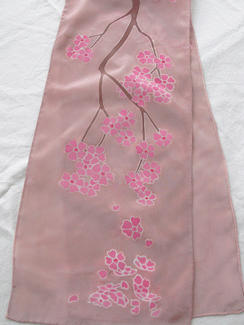
In addition to the cherry blossom and pop flower designs, I’ve been working with colors.  I think an artist just needs to create what drives them at the moment and I’ve just wanted to experiment with vibrant color combinations as well as textures (so what else is new).  It’s similar to having a hankering for Italian food—you’re just not going to be satisfied until you eat some.  Then you’ll want chocolate. . .

Cheers,
Diane


Posted in Art | Leave a comment

Navy as the New Black?

Autumn has made its appearance with a flourish of cooler weather, harvest décor in shops, and the expected array of warmer clothing in colors inspired by a forest floor.  I’ve bought the September issue of Vogue—the thickest and the most lush, with photo shoots and ads depicting the year’s most opulent fabrics and colors.

Most of the catalogs have now arrived in the mail offering up sweaters, jackets and the like in the same array of autumnal color, although I’ve noted a slight change this year.  Instead of the usual suspects simply being black and red, there is also a number of gray and browns being offered as well.  The last few years have occasionally added teal, aqua and pine as alternative color basics.  This year, I’ve noted more gray, navy, and, wait for it . . . purple.  Not the garden variety purple that you would find in an iris or on the romantic dress worn on the September cover by Kate Moss, but a variation of a deep purple looking more like a navy that stepped out of line.  I have to wonder if the Middleton sisters have inspired the fashion industry to produce more navy, blue and purple as an alternative to basic black?  If the Paris fashion shows are any indication, we can expect these same colors to work their way into spring.

Many of the garments have minimal to no detail which lend themselves perfectly to a bold piece of jewelry or a scarf to add a color boost.  The scarf works well for outerwear as well as a flowing jewelry alternative to the clothing underneath.  If you are designing your scarves for the next six months ahead, it might behoove you to add some navy and purples to your color offerings.

Cheers,
Diane

Posted in Art | Leave a comment

Thoughts on Silk Tye Dye

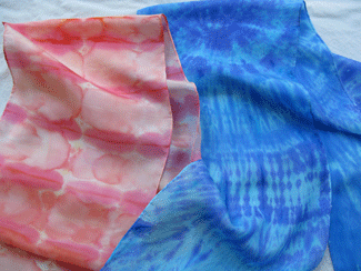
Examples of tye dye on silk scarves.Over the summer I had gotten a few emails and ads about fun art projects.  Often the subject was about tye dye.  I started wondering if the same procedures could be applied to a silk scarf as opposed to a cotton tee shirt to get similar pattern results.  After a few experiments, I realized it can be done to a degree.  Obviously, you would be working with silk dyes instead of cotton dyes and ash solutions.  It’s a little more simplistic in that you don’t need a stretcher or gutta.

This would also work well as a class project since you wouldn’t need a boat-load of stretchers.  However, I would suggest using the silk dyes that are set using an iron instead of steam setting.  This would be a good way to introduce people to fabric painting or make scarves as a team project (pinks for breast cancer or purple for Alzheimer’s).

I’ve added some instructions for silk tye dye to the instructions page on my site.  Please check it out if you are interested.

Speaking of tye dye, not far from where I live a family spent their weekends using a pop-up tent in their front yard selling tye dye tee shirts that they made as well as the opportunity to “make your own”.  I thought this was a very cool and artistic alternative to the lemonade stand.   If this idea intrigues you—you should check out your local laws and ordinances first.

Cheers,
Diane

Posted in Art | Leave a comment

Mid-June Musings

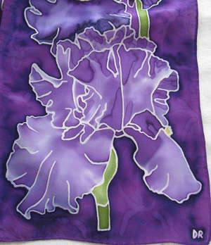
Detail of Purple IrisesI’ve finally finished the Purple Irises scarf after staring at a blank canvas for about four weeks.  Sometimes I can be quite proficient at procrastination.  I think it often boils down to OK, here’s the design—now what?  Probably my worst fault as an artist is putting off working on my projects. While at my day job, I often get ideas for new designs and mentally map them out.  The problem arises when work is finally over and I have to do the shopping, driving home, cooking dinner, doing the dishes and going through the day’s mail.  Unfortunately, there’s little time (or energy) left to put into art.  Maybe the solution is creating a false deadline.  If I’m not making something for a specific client, to instead make me the client and set a deadline for myself.

I have a few ideas for the next month to work on projects for presents, and I’m sure I will come up with more ideas during that time.  In the meantime, I’m going to focus on the fun side of summer with beachside or wish-you-were-here type designs.  Artwork can be seasonal.  My irises have long since bloomed and now I want to move on to something else.

That’s all for now.  Cheers!
Diane

Posted in Art | Leave a comment

Choosing the Right Type of Silk for Your Project

There are several types of silk from which to choose from when painting.  If you are just starting out, habotai also known as “China Silk” is probably your best bet as it is economical and has a decent smooth working surface.  Dyes are absorbed into it quickly and easily.

If you have a very detailed gutta drawing, you may want to choose a crepe silk instead as these are much easy to pencil in your design and draw using the gutta.  Crepe silk is usually a little heavier than Habotai with a more subtle sheen.  The slicker the silk, such as a type of satin, makes it more difficult to draw on.

If you are looking for something lighter for warmer weather, choose chiffon or habotai.  Chiffon is quite airy and slightly transparent.  Colors will come out just as vibrant as other types of silk.  Keep in mind that painting on chiffon takes just as much dye as other types of silk.  Don’t let the weave fool you.  You really have to use a good amount of dye and work it into the silk because of the openness of the weave.

If you have been painting for a while, and feel comfortable with a more opulent fabric, then something like charmeuse might be just the thing.  The front side is a very soft satin and the back side is a muted crepe. 

That’s all for now.  Cheers!
Diane

Posted in Art | Leave a comment